
How to Design a Services Page That Books More Clients
By Chloe Leonard, Founder of CL Studio
Your homepage gets them interested. Your about page builds trust. But your services page is where the decision gets made. And yet it's the page most service providers treat as an afterthought , a bulleted list of offerings and a price, if you're lucky. That approach leaves a lot of bookings on the table.
A well-designed services page does three things: it qualifies your visitor, communicates the value of what you offer, and makes taking the next step feel like the obvious move. Here's how to build one that does all three.
Lead With the Outcome, Not the Deliverable
The most common services page mistake is leading with what you do instead of what the client gets.
"Brand Identity Package , includes logo, color palette, typography system, and brand guidelines" describes a deliverable. "A complete brand identity built to position you as the premium option in your market" describes an outcome.
Your ideal client isn't shopping for a logo. They're shopping for recognition, credibility, growth, or relief from a problem. Lead with what they're actually buying.

Structure Your Page for Clarity
A services page that tries to explain everything tends to communicate nothing. Here's a structure that works for most service-based businesses.
Hero Section
Open with a clear statement of who you help and what you help them achieve. This is not the place for clever taglines. Say exactly what you do and who it's for.
Brief Introduction
One or two short paragraphs that speak directly to the client's current situation. What are they experiencing right now? What's the cost of staying where they are? This builds the emotional case for why they need what you offer.
Service Offerings
For each service, include a name, a short description written in terms of the client's experience and outcomes, what's included (keep this concise , think 4–6 bullet points), and a clear CTA.
If you have multiple tiers or offerings at different price points, consider giving each its own visual section or card so they're easy to scan and compare.
Social Proof
Testimonials belong on your services page, not just on a separate testimonials page. Place them close to the relevant service, not at the very bottom where most visitors won't scroll.
Your Unique Process
Showing your unique process of what it’s like to work with you from application to final send off is key to not only the customer experience, but to Google as well. Google wants to know what makes your business and service unique amongst other people trying to rank for that same service.
FAQ
A short FAQ section eliminates objections before they become reasons not to reach out. Common questions to address: how long does the process take, what do you need from the client, when is payment due, what happens after they reach out.
Final CTA
Close with a clear, low-friction call to action. "Apply to work together," "Book a discovery call," or "Get in touch" , whatever your intake process looks like. Don't make them go hunting for it.
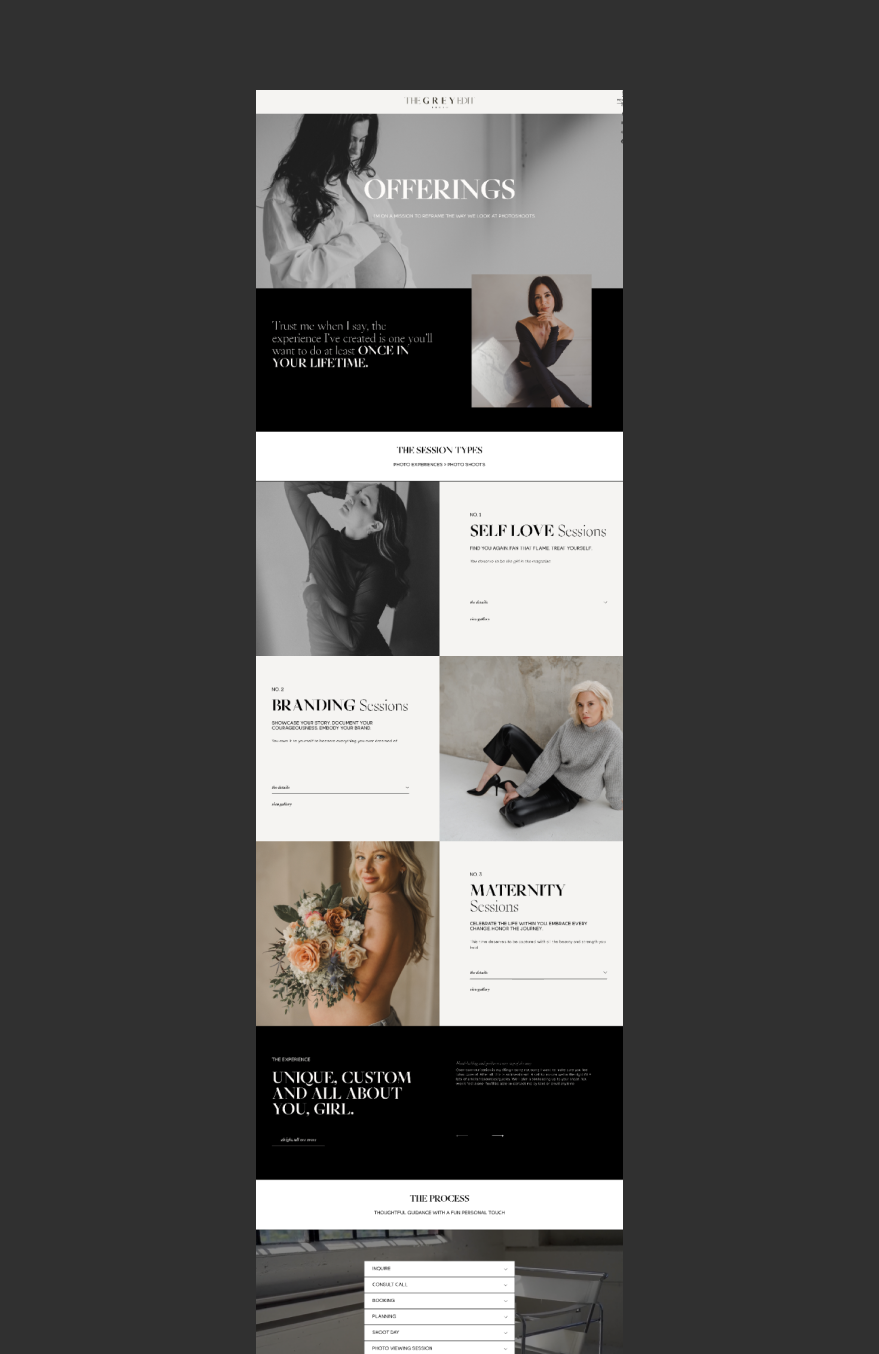
Examples of Amazing Services Pages (Okay Maybe We’re Biased)
After working with hundred of service-based clients over the years, one of our favorite things is to craft a powerful, conversion-forward services page. Here’s some examples of services pages we designed for clients!

Your brand and website should be working for you 24/7. Are they?
Get a full Brand & Website Audit delivered in 5 business days so you can stop guessing, and start fixing.
→ Limited Spots Available!
Want to do it yourself? Download our free Website Audit Guide here.
Write for the Client, Not for Yourself
Read back through your services page draft and notice how often the word "I" appears versus the word "you." A services page that's mostly about you , your process, your background, your approach , reads as self-promotional. A page written from the client's perspective reads as relevant.
This doesn't mean you can't mention your process or your experience. It means framing both in terms of what they mean for the client.
Design for Scannability
Most visitors will skim your services page before they read it in full. Make sure the most important information , what you offer, who it's for, what to do next , is visible without reading every word.
Use clear section headers, short paragraphs, white space between sections, and a CTA that appears more than once. Avoid walls of text, overly small type, and burying your contact link at the bottom.
One CTA Per Service
If you offer multiple services, give each its own clear next step. Sending everyone to the same "contact us" page regardless of which service they're interested in creates friction and loses qualified leads. A short intake form or booking link tailored to each offering performs better.
Don't Hide Your Pricing (Entirely)
You don't have to post exact prices. But giving visitors a sense of investment , whether it's a starting price, a range, or a link to download your investment guide , filters out poor-fit leads and builds trust with the right ones. Complete price opacity creates doubt and requires your ideal client to do extra work to find out if they can even afford you.
Your Services Page Reflects Your Brand
At CL Studio, when we design websites for service-based businesses, the services page always gets as much attention as the homepage. It's where positioned, strategic brands convert , and where unfocused ones lose the sale.
If your services page isn't performing the way it should, it might not be a traffic problem. It might be a clarity problem. Let's talk about what your website needs to do its job.

Hi there! I’m so glad you found us in this corner of the internet.
I'm Chloe Leonard, the founder of CL Studio, a boutique creative agency based in Nashville, TN. After 10 years of working with hundreds of clients, including Almost 30 Podcast, Clearstem Skincare, Harper Collins, and Free People, I've become more passionate than ever about giving founders the clarity and tools to build brands that TRULY stand out.
We help service-based and eCommerce businesses move from DIY beginnings to fully realized brands — built with confidence and longevity in mind through branding, web design, and email marketing. Because good brands show up, but great brands own the room for years to come.