
10 Minimalist Branding Examples That Inspire Simplicity and Impact
By Chloe Leonard, Founder of CL Studio
Minimalist branding isn’t just a trend you’ve been seeing all over social media - it’s a mindset. It's an approach that centers on exactly how intentional you can be, removing what’s unnecessary so that what truly matters can take up more space.
Minimalism values clarity over clutter, intention over ornamentation, and connection over noise.
Through the process of removing vagueness and zeroing in on your specific purpose, minimalist branding can elevate your brand’s true identity, allowing its voice, values, and story to be heard and understood without unnecessary static.
In an ever-changing market, our boutique branding agency knows simplicity and consistency stands out.
In this post, we’ll explore ten ways how a brand embodying this “less is more” philosophy and embracing simplicity can be even more impactful than a maximalist approach.

1. A Monogram with Meaning
Minimalist monograms reduce complexity while capturing essence. Think of mark designs that use negative space and subtle letterforms to say more with less.
Want to know why these marks feel so timeless? It’s because they prioritize structure that can stand on its own over decoration.
While decoration is often dependent on what’s trendy or what’s “in”, a clear monogram is lasting, making it an instant classic.
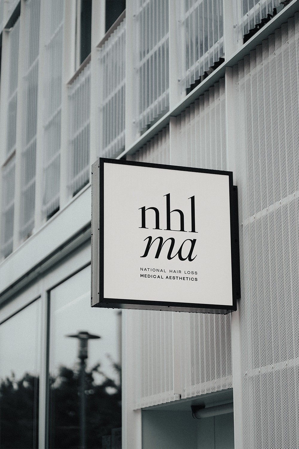
2. Streamlined Logo Systems
When brands embrace streamlined logo systems, the use of proportionality creates a sense of visual harmony across every touchpoint.
By using limited elements, balanced proportions, and consistent spacing, these logos feel calm, refined, and intentional. These streamlined logos stand out in a cluttered market because they communicate a sense of professionalism and sincerity to your desired audience.
Rather than competing for attention, streamlined logos quietly reinforce brand recognition and trust. This allows for the brand’s identity to feel cohesive, while being effortless in the mainstream.
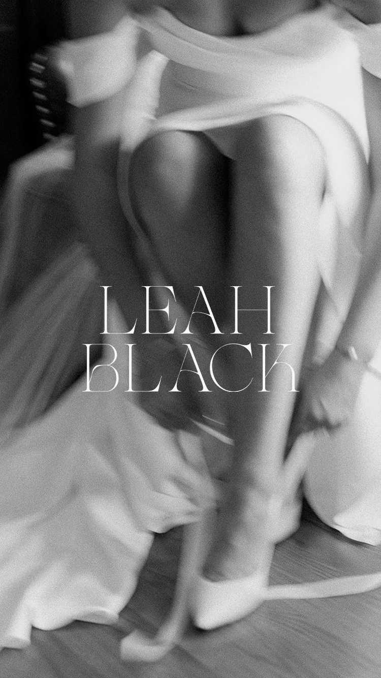
3. Elegant Typography-First Identity
One of the most underrated parts of minimalist branding is how much room it gives typography to shine. When you remove excess graphics, patterns, and visual noise, the words and the way they’re styled take center stage. The right typeface can carry just as much personality as a logo mark, sometimes even more.
Thoughtful hierarchy is what makes typography really work - your audience knows exactly where to look and how to move through your content. Nothing feels confusing or overwhelming, but rather easy and intentional.
At its best, typography-led branding feels confident without trying too hard. It shows trust in your message and lets your brand feel curated, cohesive, and quietly powerful.
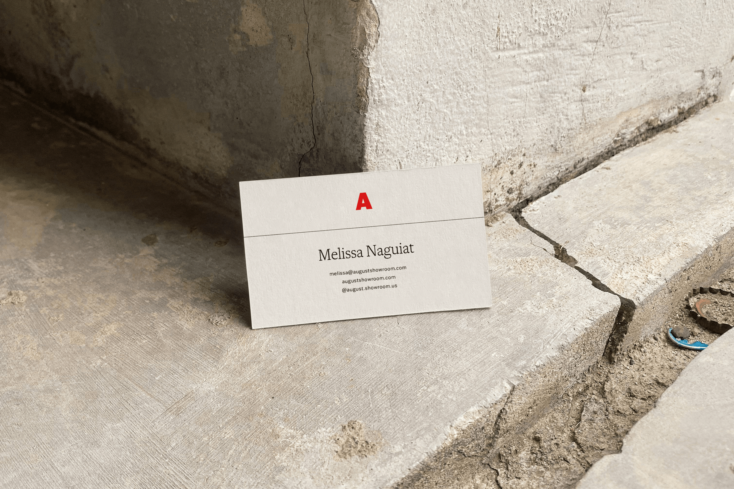
4. Neutral Color Palettes
A simplified palette of soft neutrals or monochrome tones feels modern and versatile.
The reasoning behind this? Instead of competing for attention, these colors create a clean foundation that lets your message and imagery stand out.
When the palette is uncomplicated, it gives your brand room to breathe, making everything feel more intentional.
As someone who’s spent years working on brand design for small businesses, embracing neutral color systems has made it easier to use across platforms and easier to grow with a brand over time, reinforcing simplicity while still feeling polished and confident.
5. Strategic Use of White Space
If I had to narrow minimalism down to one thing, white space is king. It’s one of the most powerful tools in minimalist branding, let alone branding overall.
What does this mean exactly? Generous breathing room around logos, headlines, and photography creates an undeniable focus around your brand and lifts the overall design.
Creating breathing room can allow anyone experiencing your brand to take it all in without feeling overwhelmed.
6. Intentional Pattern and Texture
One common misconception: minimalist doesn’t mean sterile.
Subtle patterns or organic textures grounded in a brand’s story can add depth without visual clutter. Creating sensory resonance like this then feels purposeful, rather than throwing spaghetti at a wall to see what sticks.
Personally, I LOVE some texture, especially when presenting clients with mock-ups in their brand guide.
7. Photography-Driven Branding
Sometimes photography is the star of the show when it comes to branding.
Which is why clean design paired with intentional photography allows visuals to carry emotion and narrative simultaneously.
When visual storytelling is aligned with a minimalist framework, it feels authentic and powerful.
Photography does the heavy lifting in a brand, and that’s where minimalist design really shines.
8. Minimal Packaging with Maximum Presence
Packaging that uses restraint has a way of feeling instantly premium and trustworthy.
Simple labels, minimal text, and thoughtfully chosen materials allow the product to speak for itself without unnecessary distraction. This naturally draws people in.
When brands avoid excess, the focus shifts to quality, showing that the brand values craftsmanship over clutter. In a world full of overdesigned packaging, restraint stands out.
Impact doesn’t come from more, but from choosing the right details and letting them shine.
9. Scalable Brand Marks
One of the biggest strengths of minimalist branding is how well it scales : nothing gets lost, and nothing feels crowded.
When a brand mark is simple and intentional, it works just as well blown up on a website as it does shrunk down into a social media icon or tucked onto printed materials.
This kind of flexibility makes your brand easier to use day to day.
Clean marks hold their shape and clarity everywhere they show up, which helps your brand feel consistent, recognizable, and polished across every touchpoint.
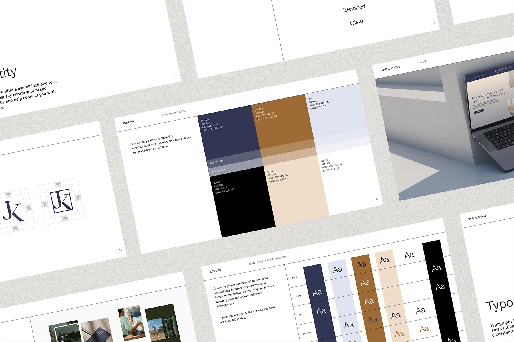
10. Cohesive Brand Systems
True minimalist branding goes far beyond just a logo or a color palette. It’s about creating a full system where everything feels cohesive, from typography and spacing to imagery and layout, rather than pieced together.
This makes a huge difference in how your brand is experienced because every touchpoint feels consistent and considered, building trust and recognition over time. .
Design should elevate rather than overwhelm.
Minimalist branding creates space for connection, allowing your audience to focus on what truly matters and feel aligned with your message from the first interaction. Less clutter, more clarity.
Because in the end, choosing simplicity is not about stripping your brand down, but about refining it with intention.
As a creative agency for small businesses, this process starts with strategy. At Chloe Leonard Studio, we help you clarify your values, define your voice, and translate your vision into a cohesive visual identity that feels both effortless and impactful.
Through thoughtful design decisions and purposeful restraint, we create brands that feel calm, confident, and deeply aligned with who you are and who you want to reach. As you refine your own identity, let these examples remind you that clarity is powerful.
When your visual language is rooted in intention and guided by strategy, your brand does more than look good. It builds trust, creates recognition, and leaves a lasting impression.

Hi there! I’m so glad you found us in this corner of the internet.
I'm Chloe Leonard, the founder of CL Studio, a boutique creative agency based in Nashville, TN. After 10 years of working with hundreds of clients, including Almost 30 Podcast, Clearstem Skincare, Harper Collins, and Free People, I've become more passionate than ever about giving founders the clarity and tools to build brands that TRULY stand out.
We help service-based and eCommerce businesses move from DIY beginnings to fully realized brands — built with confidence and longevity in mind. Because good brands show up, but great brands own the room for years to come.

Your brand and website should be working for you 24/7. Are they?
Get a full Brand & Website Audit delivered in 5 business days so you can stop guessing, and start fixing.
→ Limited Spots Available!
Want to do it yourself? Download our free Brand Audit Guide here.