
What Your Med Spa Website Needs to Actually Convert
By Chloe Leonard, Founder of CL Studio
Your med spa website can be gorgeous and still send potential clients straight to a competitor's booking page. Traffic usually isn't the problem. Trust is. If people are landing on your site and leaving without booking a consultation, the fix isn't a total redesign for the sake of it; it's tightening a handful of specific things that make someone feel safe enough to hand over their name, their number, and eventually their face.
Med spa shoppers are a different animal than most small business website visitors. They're comparing providers, researching a procedure they've never had done, and deciding who they trust with their skin, often at 9pm on their phone, mid-scroll. Here's what actually moves that person from "just looking" to "booked."
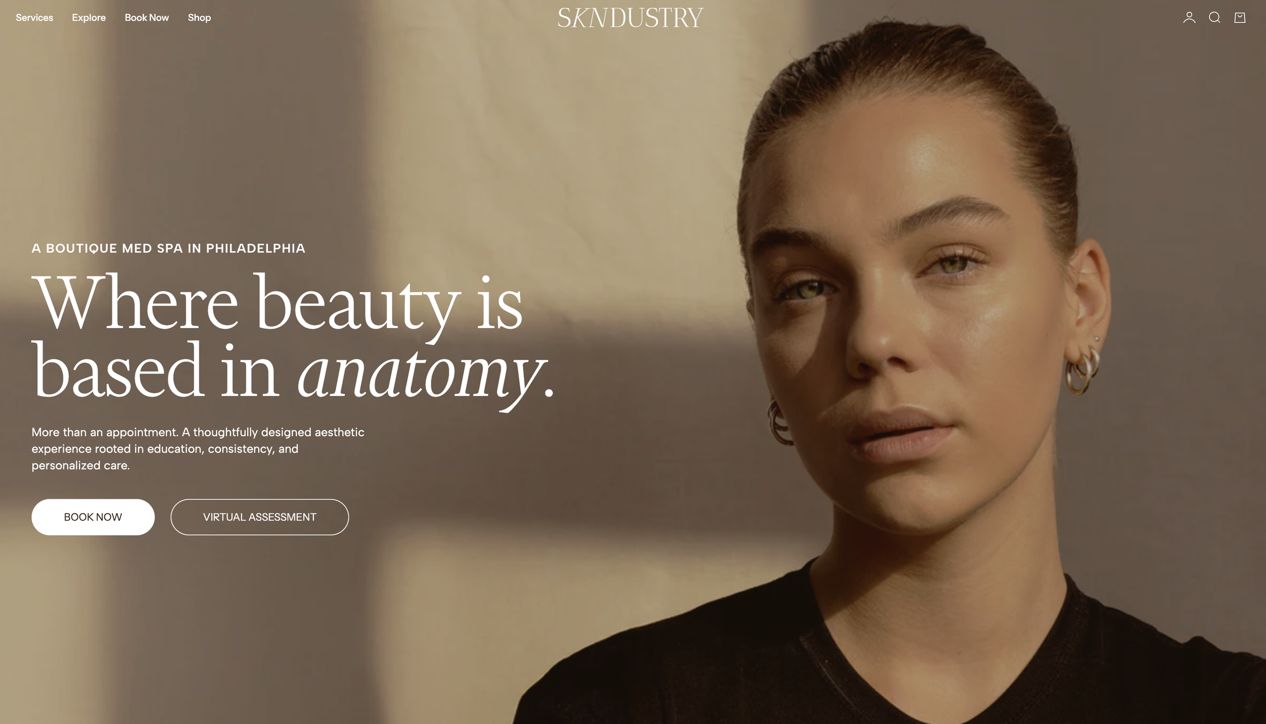
This homepage banner is a great example of using both location-specific wording as well as overall brand messaging.
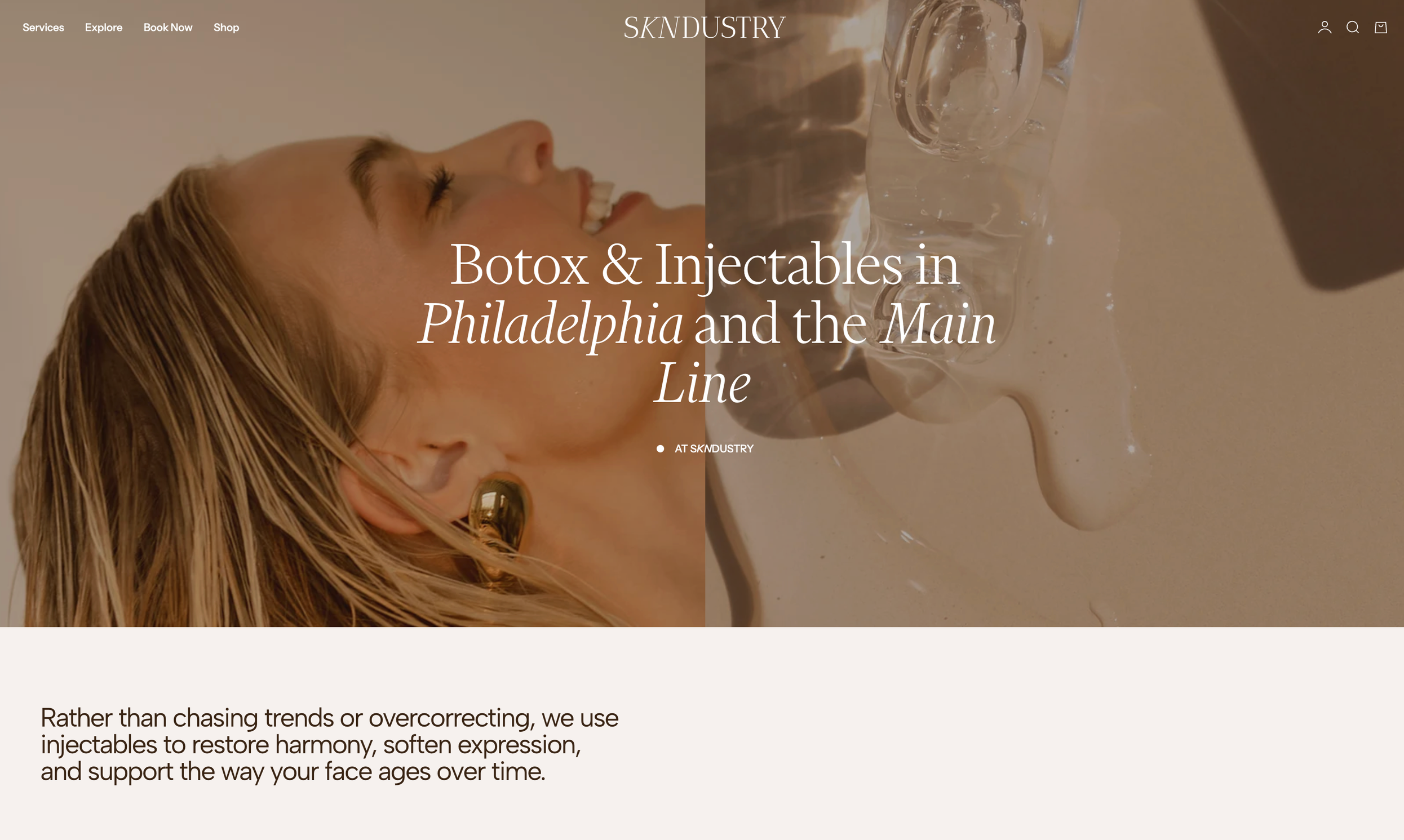
This is another example of a banner for a med spa website that shows exactly what kind of services they offer and where.
The First Five Seconds Decide Everything
Your homepage has one job: tell a stressed, skeptical visitor exactly what you do, who you do it for, and what to do next, before they have a reason to leave.
That means your hero section needs a real headline, not a vibe. "Medical Aesthetics, Redefined" tells a visitor nothing. "Botox, Filler & Laser Treatments in Nashville" tells them they're in the right place. Save the brand personality for your photography and voice. Your headline's job is clarity, not cleverness.
Your hero image matters just as much as the words. A generic stock photo of a model with perfect skin doesn't build trust. It actually creates distance, because it doesn't look like your actual practice. Real photography of your space, your team, or your work does more conversion heavy-lifting than almost anything else on the page.
And the call to action above the fold should say what it does. "Book a Consultation" outperforms "Learn More" every time, because it removes the guesswork about what happens when someone clicks.
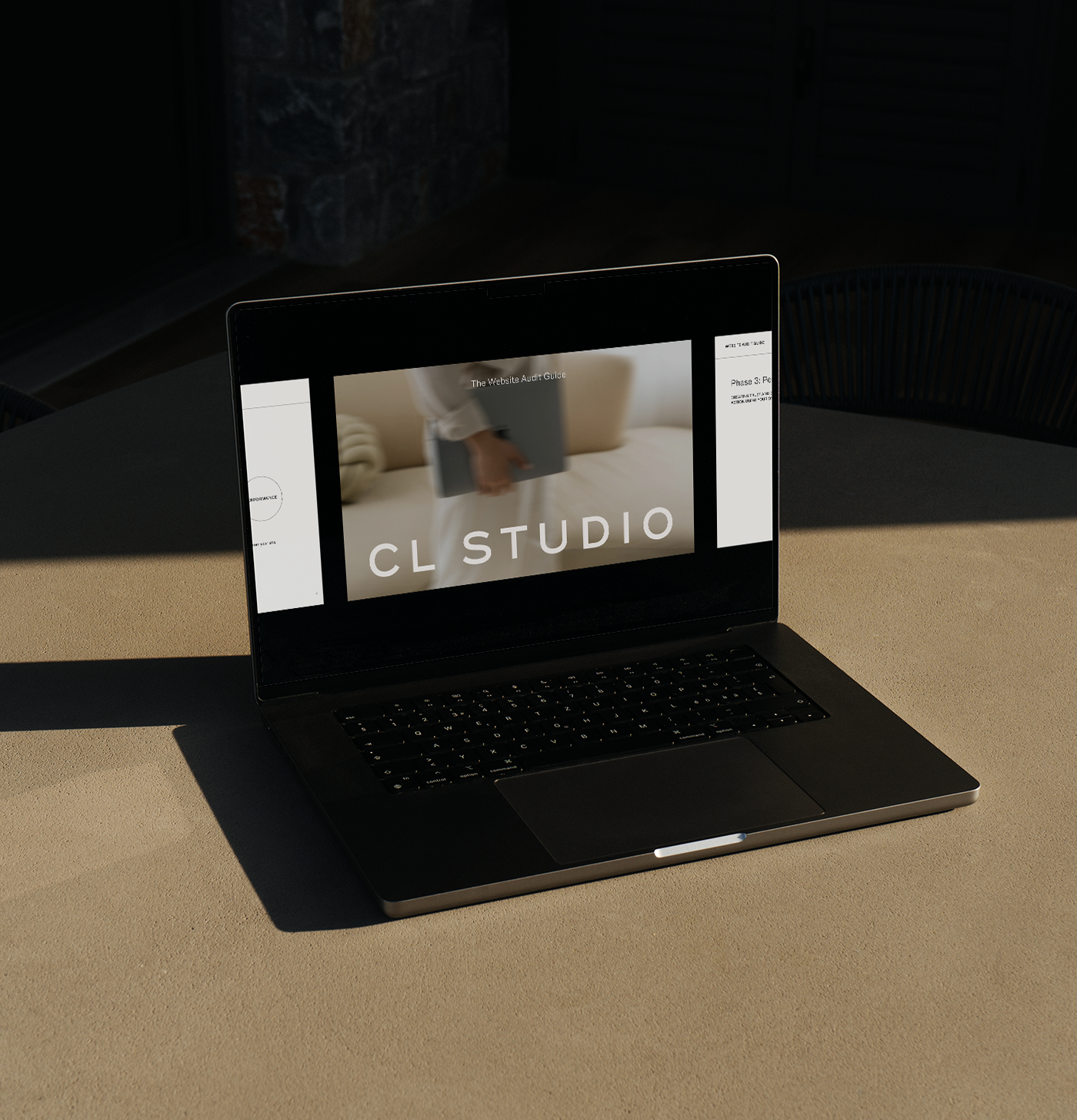
Download Our Free Website Audit Guide
Not sure if your current med spa website is working as hard as it should be? Download our free Website Audit Guide and run your own evaluation before your next relaunch or redesign.
The Trust Signals Med Spa Shoppers Actually Look For
A therapist's website needs to feel warm and safe, we've written about that specifically in Branding for Therapists. A yoga studio's needs to feel inviting. A med spa's needs to feel both of those things, plus clinically credible, because you're asking people to trust you with needles, lasers, and their face. That's a different bar, and generic "we're passionate about beauty" copy doesn't clear it.
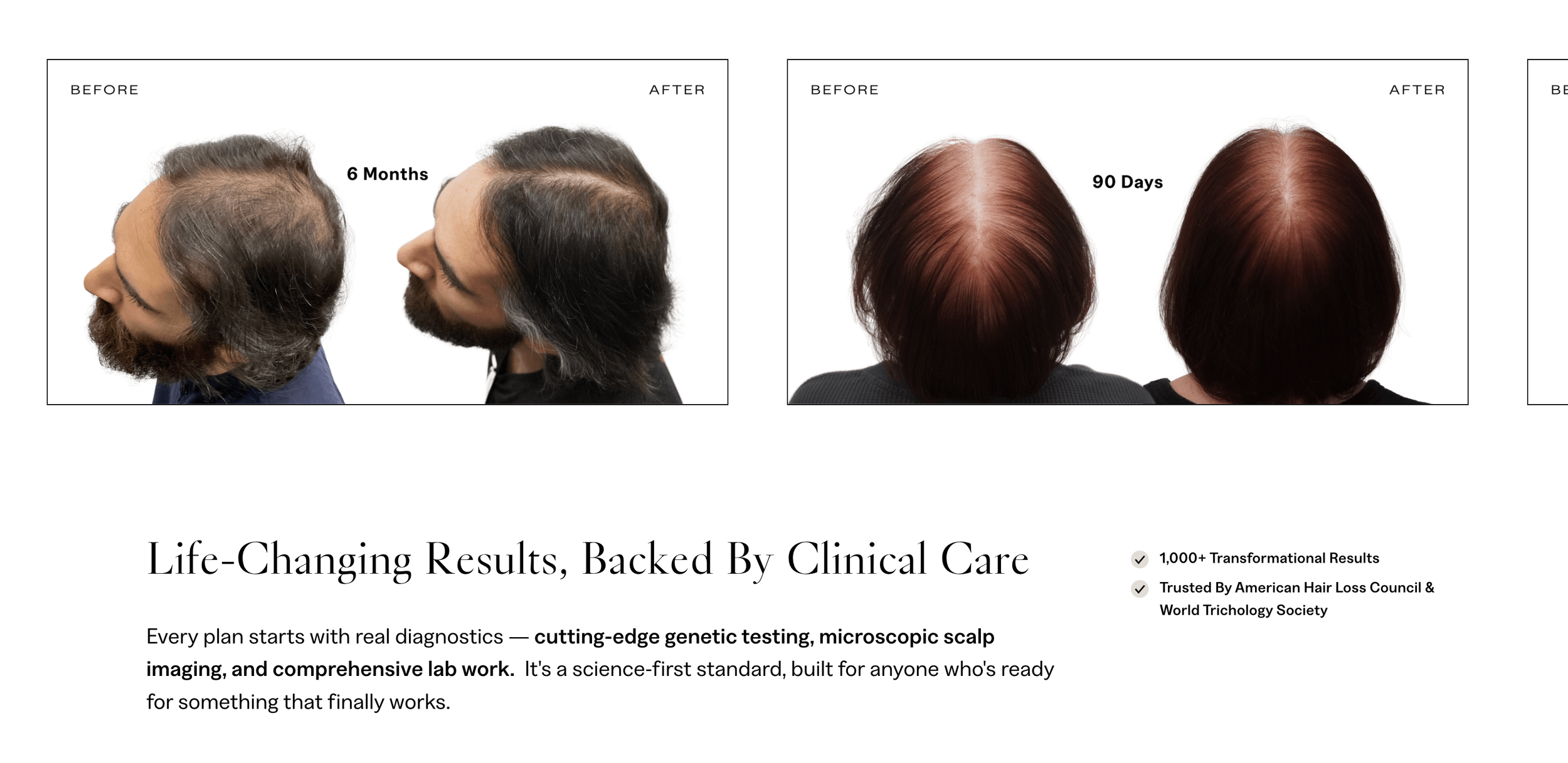
These well-lighted before and after photos for my client NHLMA, a med spa/hair loss center in Scottsdale, show the specific duration of their client results which is key for potential clients being able to build trust.
Before-and-After Photos
This is the single most-requested piece of proof for aesthetic treatments, and vague or absent before-and-afters are one of the fastest ways to lose a visitor. They need to be:
Organized by treatment, not dumped into one giant gallery
Consistent in lighting and angle so the comparison actually means something
Labeled with the treatment and, ideally, the number of sessions
If you don't have real client photos yet because you're new or clients haven't consented to sharing theirs, say so honestly on the page rather than leaving the section empty or filling it with stock images. An empty gallery reads as inexperience, and a fake one erodes trust the moment someone notices.
Provider Credentials, Front and Center
Who is actually doing the injecting? Visitors want to know before they book, not after they arrive. Your medical director, RN, NP, or physician should be named and credentialed on the site, not buried on an "About" page three clicks deep. A short bio with credentials near your services or on the homepage does more trust-building than another paragraph about your mission.

For my client NHLMA, a med spa and hair loss center in Scottsdale, we added their credentials including associations they are backed by as well as their Google reviews rating in their footer so it shows up on every page.
Reviews That Are Specific, Not Generic
"Amazing experience!" doesn't do much. A review that mentions the treatment, the provider, and how the person felt afterward is far more persuasive, and far more believable, than a five-star badge with no context. See the example below!
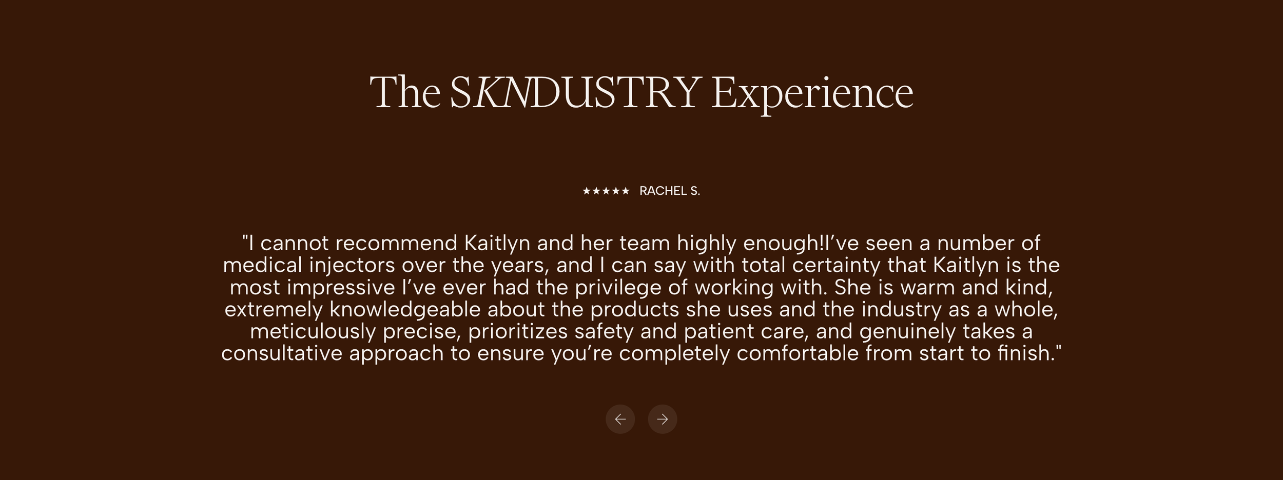
This is a great example of a med spa review that is specific in terms of provider, treatments, and experience in the med spa as a whole.
Why a Cluttered Services Menu Kills Conversions
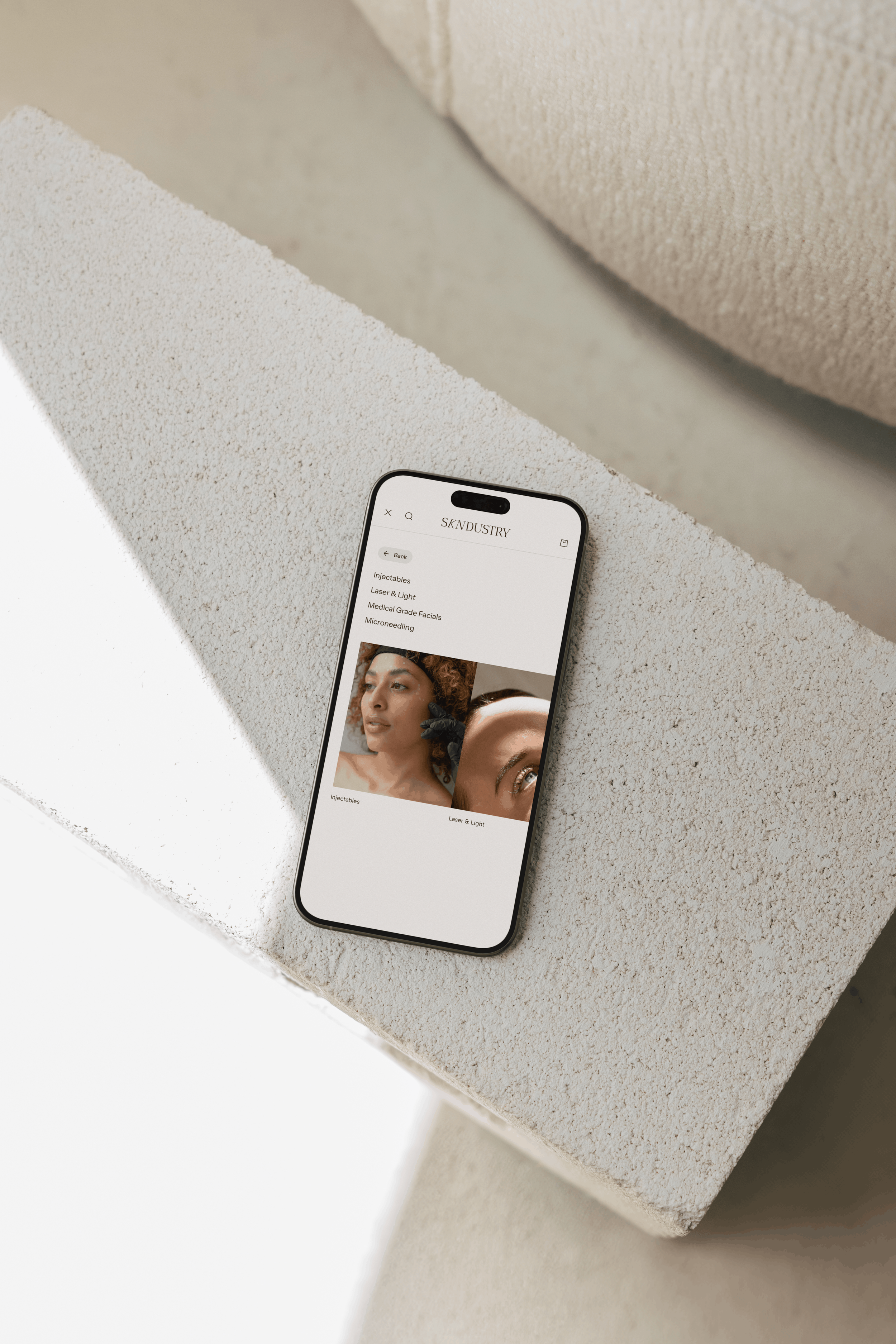
Med spas tend to offer a lot: injectables, facials, laser, body contouring, memberships, IV therapy. It's tempting to list every single service as its own nav item, and that's exactly what overwhelms a visitor before they've found what they came for.
The fix is grouping by category, not alphabetizing everything into a 20-item dropdown. A visitor searching "lip filler near me" doesn't want to parse a menu with fifteen unrelated services before they find it. Structure your navigation around a handful of clear categories: Injectables, Facials & Skin, Body, Wellness, each with its own page that goes deeper.
Even better: organize part of your site around the outcome the client wants, not just the treatment name. Someone who doesn't know the difference between microneedling and a chemical peel still knows they want "smoother skin" or "less redness." Meeting people where their knowledge actually is, rather than assuming they already speak your industry's language, is the same principle that makes a good [internal link: Branding for Health and Wellness Businesses] approach work across wellness-adjacent brands, not just med spas.
Pricing Transparency (Or the Right Kind of Vagueness)
You don't need to publish an exact price list. And for treatments with real variability, you probably shouldn't. But "Contact us for pricing" with zero other information is one of the biggest bounce triggers on a med spa site, because aesthetic treatments are heavily comparison-shopped and a visitor with no price anchor will simply go find one somewhere else.
The middle ground works well: starting-at pricing ("Botox from $12/unit," "Facials from $150") or a downloadable pricing guide gathered behind a simple form. Either gives visitors enough to self-qualify without you having to quote every possible combination of add-ons up front.
Mobile Experience Is Not Optional
Most med spa searches happen on a phone: often a "near me" search, often outside business hours, often on a lunch break or right before bed. If your site is slow, your tap targets are tiny, or your booking button is buried, you lose that visitor to whichever competitor made it easier.
A few things worth auditing on your own phone right now:
Can you tap "Book Now" without zooming in?
Does your booking link or phone number work with one tap, no copy-pasting a number?
Do your before-and-after images load quickly, or do they lag because the files are too large?
Is your navigation menu easy to open and close one-handed?
Before-and-after galleries are usually the heaviest part of a med spa site, image-wise, so they're also the first place mobile speed problems show up. Compressing images properly matters more here than on almost any other type of small business site.
Make the Booking Path Obvious
Once someone is convinced, don't make them hunt. Your primary call to action (book a consultation, request pricing, whatever your actual first step is) should appear in your main navigation, in your hero section, and again after any section that builds trust (your before-and-afters, your provider bios, your reviews).
This is one of the same principles that shows up across every website project we build: the goal isn't more content, it's a clearer, shorter path from "interested" to "committed." For a med spa specifically, that path is booking a consultation, so every trust-building section on your site should end with an easy way to take that next step, not just more information to read.
Frequently Asked Questions
How much does a med spa website redesign cost?
A full custom brand identity and website from a boutique agency typically runs $8,000–$20,000+, depending on scope, with semi-custom packages available as a middle ground. Cost usually comes down to how much custom design, copywriting, and photography direction is involved versus working from an existing framework.
How long does a med spa website project take?
Most full branding-and-website projects take 6–12 weeks from kickoff to launch. That timeline includes strategy, design, content, and revisions. And it can shift depending on how quickly photography, provider bios, and before-and-after assets are ready on your end.
Do I need a HIPAA-compliant contact or intake form on my website?
If any form on your site collects health information, not just a name and phone number, but details about a client's medical history or the specific treatment they're asking about, it's worth talking to a compliance professional about whether that form needs to be HIPAA-compliant. At minimum, keep general inquiry forms limited to non-medical information and route any actual intake through a secure, compliant system rather than a standard website form.
Should I show real client before-and-after photos, or is that too risky?
Real, consented before-and-after photos are one of the strongest trust signals a med spa site can have, and they're worth the extra step of getting proper client permission. What's actually risky is an empty or stock-photo gallery. It signals you don't have results to show, whether or not that's true.
What platform is best for a med spa website: Showit, Squarespace, or WordPress?
We build on Squarespace because it gives med spas the design flexibility to showcase before-and-afters, provider credentials, and treatment pages exactly the way they need to be organized, without the plugin bloat that can slow down a WordPress site. The right platform ultimately depends on your team's comfort making updates and how custom your design needs are. But for image-heavy, conversion-focused sites like most med spas need, Squarespace tends to be the strongest fit.
Ready to Fix What Isn't Converting?
If you've read this far and you're mentally checking off which of these your site is missing, that's a good sign. It usually means the fix is more specific than it feels from the inside. We'd love to take a look at your current site and talk through what's actually holding back your bookings, no pressure and no generic pitch. Reach out and let's set up a time to talk about what a med spa website that actually converts could look like for your practice.

Hi there! I'm so glad you found us in this corner of the internet.
I'm Chloe Leonard, the founder of CL Studio, a boutique creative agency based in Nashville, TN. After 10 years of working with hundreds of clients, including Almost 30 Podcast, Clearstem Skincare, Harper Collins, and Free People, I've become more passionate than ever about giving founders the clarity and tools to build brands that TRULY stand out.
We help service-based and eCommerce businesses move from DIY beginnings to fully-realized. brands – built with confidence and longevity in mind. Because good brands show up, but great brands own the room for years to come.