
How to Create a Landing Page That Actually Converts
By Chloe Leonard, Founder of CL Studio
A landing page is not a homepage. It's not an about page. It's not a general-purpose destination.
A landing page has exactly one job: to convert the visitor. That means one offer, one message, one call to action. No distractions, no navigation menu sending visitors off to explore the rest of your site, no competing priorities.
Get it right, and a landing page is your hardest-working sales tool. Here's how to build one that actually works.
The Anatomy of a High-Converting Landing Page
A Clear, Compelling Headline
Your headline is the most important element on the page. It should immediately communicate: what this is, who it's for, and why it matters. If a visitor can't understand your offer from the headline alone within 3 seconds, you've already lost them.
Not: 'Welcome to My Coaching Program.' That tells them nothing.
Better: 'Build a Brand That Attracts Premium Clients, in 90 Days.' That's specific, benefit-led, and time-bound.
A Strong Subheadline
Use the subheadline to add depth to the headline. If the headline captured attention, the subheadline earns the next 30 seconds of reading time. It should expand on the core promise and hint at how you'll deliver it.
Hero Image or Visual
The visual at the top of your landing page should reinforce the offer, not just look pretty. For a service, this might be a photo of you, a mockup of the deliverable, or a visual representation of the transformation.
Benefits, Not Features
The body of your landing page should answer: what does this do for me? Lead with outcomes. Features tell; benefits sell. 'Includes 10 one-hour sessions' is a feature. 'Finally feel clear on your brand direction in 10 focused sessions' is a benefit.
Social Proof
Testimonials, case studies, client logos, media mentions, any evidence that other people have trusted you and gotten results. Social proof reduces the risk the buyer feels and dramatically increases conversion rates.
A Single, Clear Call to Action
One CTA. Not four. Not an offer and a newsletter signup and a free download. One. Make it specific and action-oriented: 'Book My Strategy Call,' 'Get Instant Access,' 'Apply Now.' The CTA should appear multiple times on the page, at the top, mid-page, and at the bottom.
Remove All Navigation
This is the one element most people forget. A landing page should not have a full navigation menu. Every link you give a visitor is an exit ramp. Remove the distraction and keep them focused on the one action you want them to take.
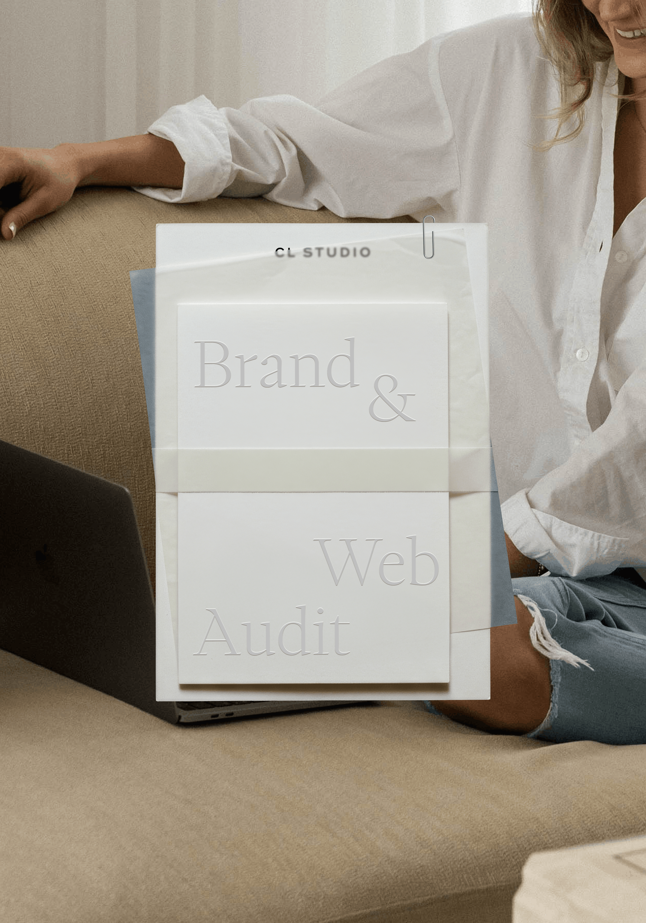
Your brand and website should be working for you 24/7. Are they?
Get a full Brand & Website Audit delivered in 5 business days so you can stop guessing, and start fixing.
→ Limited Spots Left!
Common Landing Page Mistakes
Trying to do too much. One page, one offer, one CTA.
Writing too much copy above the fold. The headline, subheadline, and CTA should be visible before any scrolling. Save the detail for further down the page.
Using vague or passive language. 'Learn more' is not a CTA. 'Book my free strategy call' is.
Forgetting mobile. More than half of landing page visitors are on phones. A page that's not optimized for mobile is losing conversions constantly.
Landing Pages That Convert Are Strategic, Not Just Pretty
At CL Studio, we build websites for small businesses and landing pages that are designed to perform, not just look good in a screenshot. If you're ready for a site that actually drives inquiries, let's talk.

Hi there! I'm so glad you found us in this corner of the internet.
I'm Chloe Leonard, the founder of CL Studio, a boutique creative agency based in Nashville, TN. After 10 years of working with hundreds of clients, including Almost 30 Podcast, Clearstem Skincare, Harper Collins, and Free People, I've become more passionate than ever about giving founders the clarity and tools to build brands that TRULY stand out.
We help service-based and eCommerce businesses move from DIY beginnings to fully-realized. brands – built with confidence and longevity in mind. Because good brands show up, but great brands own the room for years to come.